First up, Layout Mode. That’s where you can create fields, change their positions, style them, or delete them.
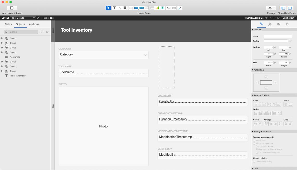
Claris helpfully kept the basic set up the same as in the quick start:
- Left – layouts and fields
- Center – viewable canvas, it’s what you’ll see in Browse Mode
- Right – Inspector (with four icons worth of input options to give you much more control over styles and data input)
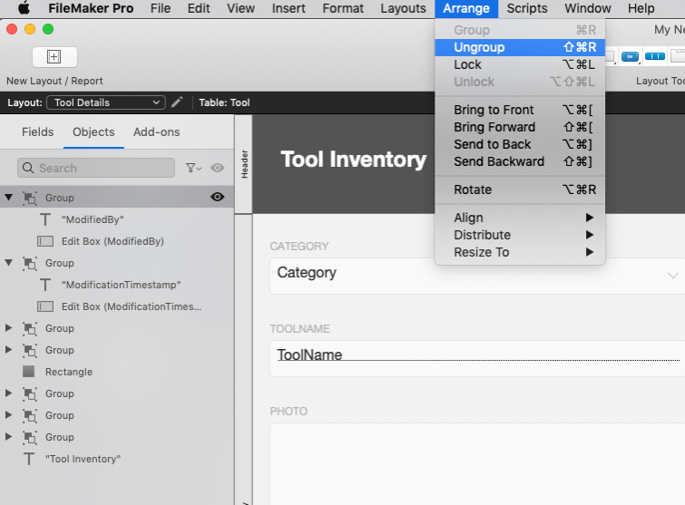
In the left panel, note that those fields you created during the quick start appear to be Groups, Groups, and more Groups. Click on a Group folder to reveal the field and label beneath it. Or go wild and Ungroup them from the Arrange menu at the top of the app window. You can delete a label, move it to a new spot, have some fun!
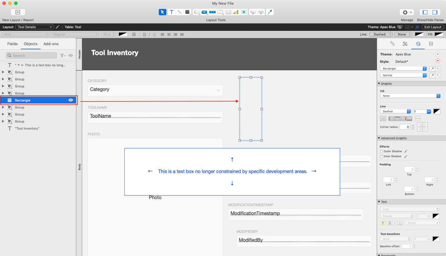
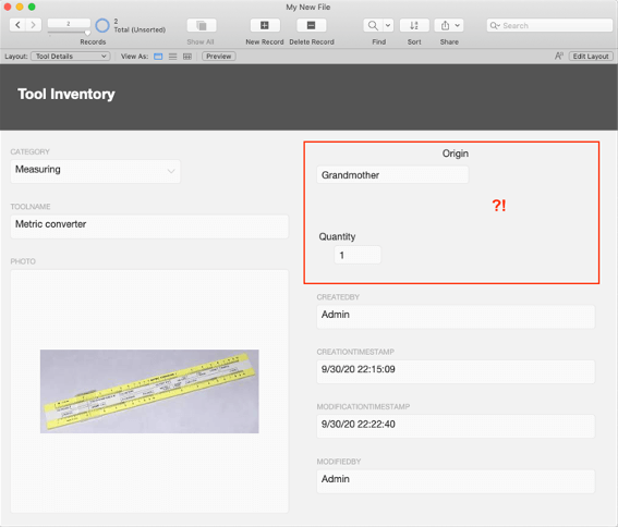
And that spacer that you may have used during quick start? It no longer functions as a spacer, it’s a rectangle object. I’d select that and delete it. You can always add a text box or shape when you need it.
Quick start’s relative positioning is a bit like bumper cars: sometimes it’s fun to use one object to push other objects around and sometimes it’s just frustrating and gives you a headache.
You now can have objects stretch across the layout. Best to keep them within the bounds of one Part though!
Or maybe you realize you’d like to add a few fields, change a field type.
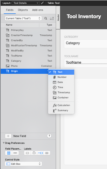
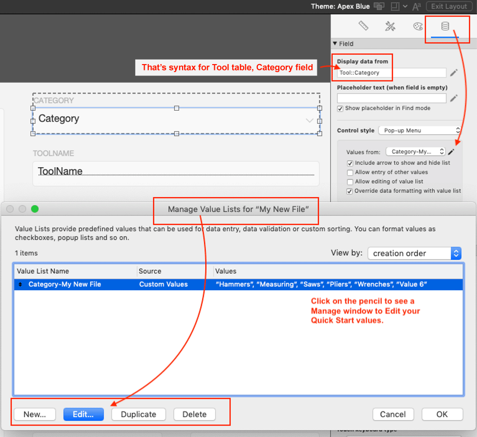
One thing that’s different from the quick start is that FileMaker does not have Field types of checkboxes, radio buttons, etc. Those are Control types for Text, Number and Date fields, and time and timestamp fields. Head over to the Data Inspector, click on the pencil icon to get a window where you can edit, add, delete from Value Lists.
A quick tip (this is all quick, huh?): radio button controls allow one value to be selected (Extra Cheese only for that pizza), but a checkbox control allows multiple values (Extra Cheese, Pineapple, Pepperoni, AND antacids)
Another non-standard item in quick start caught my eye: the Fixed Position option in the Inspector.
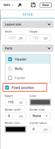
Turns out, if Fixed Position is selected during quick start, the top part of the layout will be a Top Navigation type, and that can be handy for mobile devices and longer layouts that require scrolling.
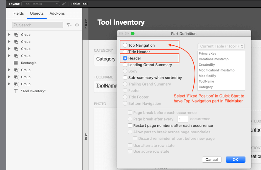
Don’t worry if you didn’t mark Fixed Position while in quick start; you can change it quickly (ugh) in Layout Mode and choose a different header type in the Part Definition window.
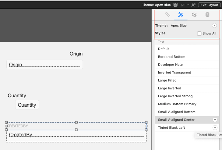
Take a look at the Styles Inspector too. It’s an easy, qui (I’m not going to write it) way to make your fields and labels have a consistent look. Claris FileMaker’s new default Theme is called Apex Blue. I don’t know why, because it isn’t blue.
Now that you’ve made some changes, take a look in Browse Mode and realize restraint might work a bit better than labels and fields plopped any ol’ where on the layout.
Or maybe you realize it all needs to be bigger and every color of the rainbow. It’s your app, do what you wanna do!
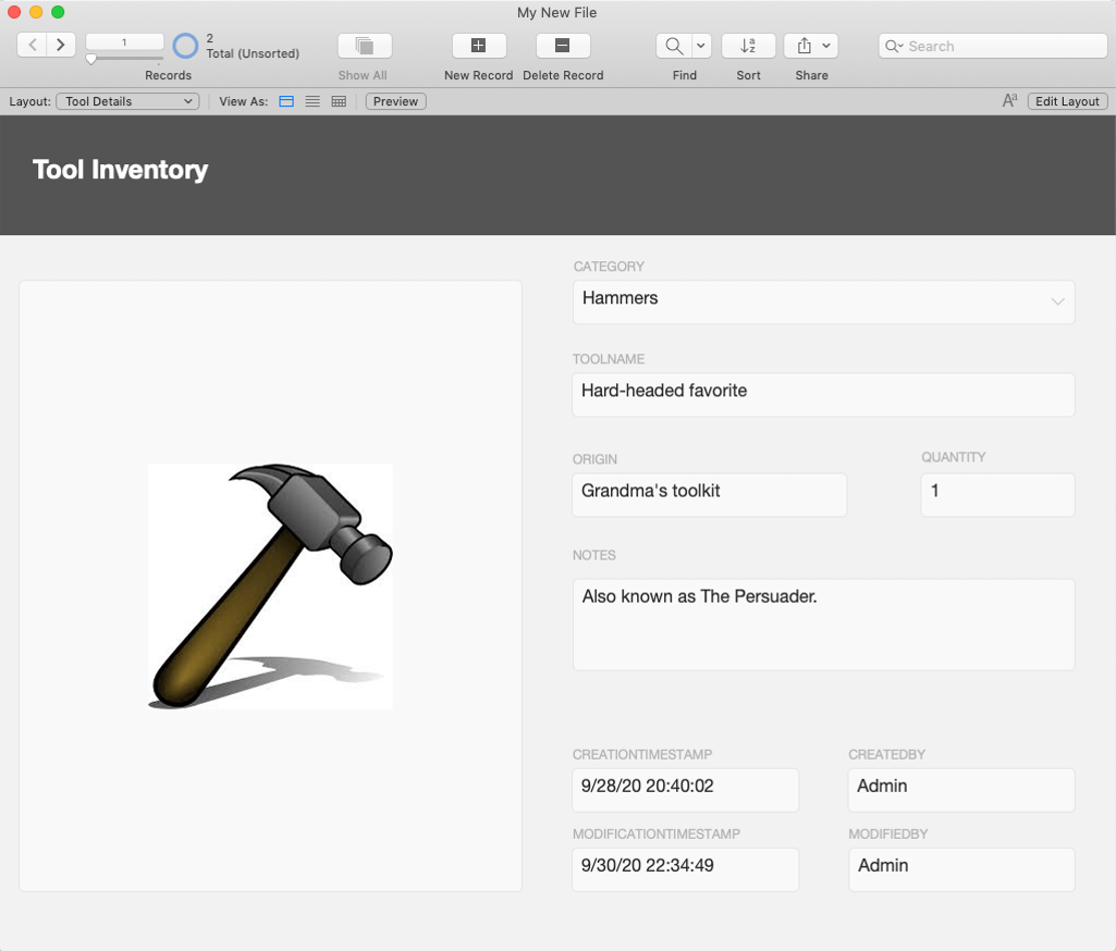
Me? I’ve been doing this a while, and all my creativity is saved for organizing nails and bolts by color and size. I changed my fields to make the photo more prominent (and deleted the label of “Photo” as it seems obvious). I gave less screen space to utility fields for Creation and Modification and more space for Notes.
So that’s it! If you’re interested in learning more about design guidelines, check out my colleague, Mark Baum’s insights on FileMaker’s user interface design. If you need any help with your solution, contact our team. We’re happy to provide direction.