This is the fourth in the series of posts about the Web Viewer Integrations Library.
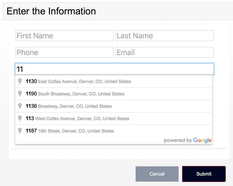
The FileMaker Web Viewer Integrations library is a great source for deeper functionality for your custom app. There are 22 web integrations that might be a great solution for a use case you’re trying to solve for yourself or for a client. For example, you can use the “Google Auto-Complete Address” integration to use the power of Google to get the exact full address as the user starts to type it in as shown in Figure 1.
That is extremely handy.
Data Tables Integration
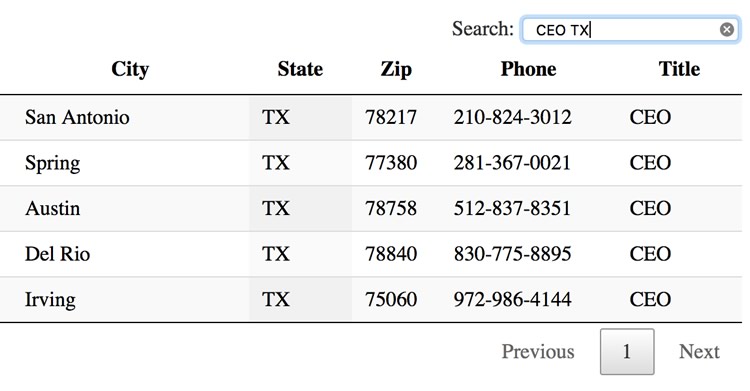
Or the Data Tables integration. This could be a good substitute for a typical list view in FileMaker (see Figure 2). The integration allows a user to click on a column header to sort by that column or to do a filter to see only certain records.
Regardless of the integration that becomes useful to you, it might need some revision of its current state. This library provides the perfect opportunity to adjust what is here to make it work well for your custom app. You might change the colors or the font. You might want to add additional functionality, or even remove some of the functionality. Whatever needs to happen, you can do it here without fear of messing up your app.
For those that have less experience with the languages of the web (HTML5, CSS, JS…), you can use this tool to learn more about how the CSS interacts with the rendering. While this library does not give you a complete understanding, it can add to your knowledge. I know I learned a lot while setting up these integrations.
This library allows you to play with and update the settings as necessary. There are a few features in here that allow for this. Let’s take a look at them.
Features of the Library
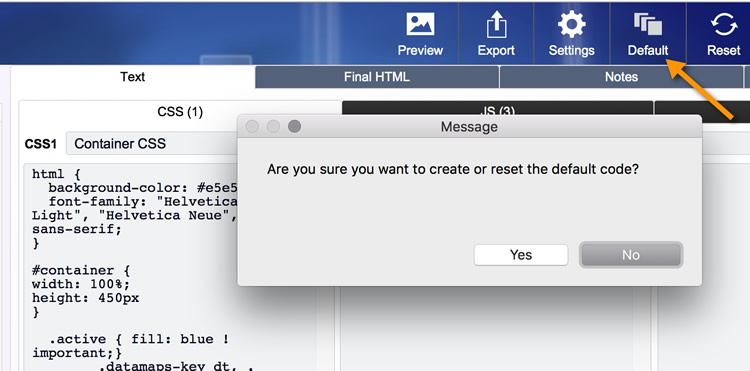
The Default
Each integration can be manipulated to your satisfaction, but there’s always a danger, in the manipulation, to mess the code up beyond repair. I bungled the code many times in my own work with this. Agnes Riley had the great suggestion of creating a table of the default code: a record hidden in the database that you can fallback on for any reason to restore the original code.
A benefit of this is that once you’ve manipulated the code perfectly for your use, you can set that as the new default. That way it becomes your default ready for further manipulation.
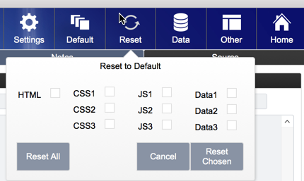
Reset
In the event you have to revert back to the default code, there’s a reset button. This gives you the option to reset any or all of the text, including the data sample provided. I’ve used this often. It is a lifesaver.
Expanded View
The CSS, JS and Data fields are found in popovers. You can simply open them up to view and edit the existing code. See Figure 5.
Playing Around
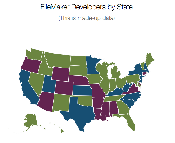
This library is yours to manipulate. If you don’t like the colors I’ve provided, change them. As an example, let’s look at the Data Maps integration.
I want to integrate into a client’s custom app the map of the US showing different colors depending on the underlying data. These default colors are decent, but they don’t fit the color scheme of my client’s file.
I also want to remove the gray background, and make the sub-header font bigger. I can make those changes easily.
The first thing I’ll do is make sure there’s a default code. So I’ll set the default to what I’ve got on the screen at the moment. That probably will come in handy as we move along.
The next step is to get rid of the gray background and make the sub-head font bigger. Since those elements are part of the HTML, the place to manipulate those is in the CSS.
Changing the CSS
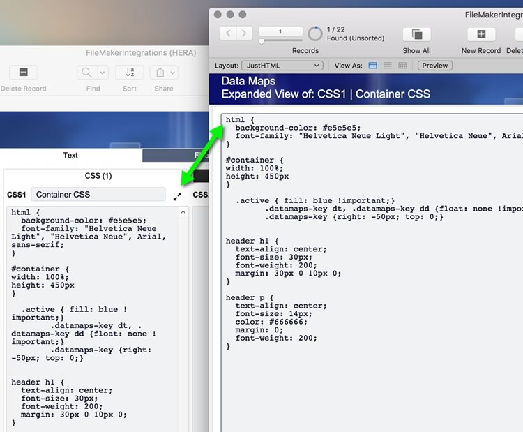
CSS1 provides the text we need to update.
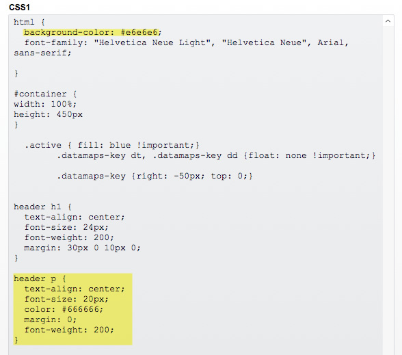
Here I can simply change the color of the html background-color attribute. Colors rendered in HTML are in the format of the Hex value, so I can use the Hex Color Picker, found as a link in the Sources tab to find the color with which I want to update the color. I chose a plain white background, or code #ffffff. You choose what you wish.
Now I need to update the sub-head. It is too small compared to the title and the map. So I’ll find the tag that surrounds the text. It is in a <header> <p> </p> </header> tag set, so I need to find the styling of that attribute in the CSS1.
I made my font-size attribute to be 20px. That looks good.
With those two simple changes, my integration looks better. Since I want to keep it that way, I’m going to press the “Default” button to set this as my new default.


I need to make one more change: the colors of the states. Those look pretty bright, and they’re the wrong color for my custom app.
JavaScript (JS2 field)
This integration works by drawing each state in its correct location and giving it a color based on the data presented. In this case the data text in the data tab, shows the “fillKey” attribute for each state object. The fillKey for Alabama is “HIGH” based on the data (Note the fillKey’s attribute is case-sensitive). So the state of Alabama will get whatever color I’ve assigned to the HIGH attribute. This is found in the JavaScript, in the JS2 field.
I can update the colors of each type of state here in the JS2 fields (see Figure 9). Using the hex color picker in the source tab, I can select any four colors I want.
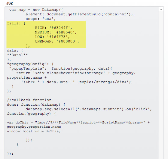
Once I’ve got the colors how I want them, I’ll be sure and set this current code as the default code.
Finished
With just a few steps and a small hunt through the code, we are able to make changes and save it as the default. You can change anything in here. If you know a bit of JavaScript, you can update the code to do something different than what is currently set.
Play around with the file; experiment with the code and see what happens in the preview pane.
As always feel free to reach out if you need some advice on manipulating a particular integration. I’d be happy to lend a hand.
Enjoy!
Get the Demo File
If you have any questions, please reach out to our Carafe team.
Next Post
These are the other blog posts and videos that go into further detail about this file and how to integrate these into your own custom apps:
Great work, Jeremy.
On the Data Tables integration, it will be nice if you can add horizontal scrolling , adjust individual column width and dynamically drag-n-drop to change column position
Thanks for the feedback.
It is pretty easy to add the features you are thinking of. Check out the documentation from the source tab. There’s a specific option to add to the code to enable those features. In the next version of this library, I’ll add those as well.
I have a question regarding the sorting. When data first display in web viewer, it looks to me it is sorted by the ID or creation order. I may be wrong on this one. is there a way I can configure the default sorting order ? Thank you very much
Hi.
Are you talking about the data table? For sure the default sort can be anything you want. Look in the DataTables scripts in my file to see where the scripting goes to the people table and loops thru the records. Simply put a sort there by whatever you wish.
The data should be presorted before it gets gathered for the table.
You might also want to check the documentation of the integration. There might be a setting to determine which column is the default sort. I haven’t looked into this, but it might be in there.
Hi,
I can confirm that the default sorting is on ID. Even when I sort the data before it gets gathered, the display is always sorted by the ID. I will check the documentation. As you have said , there might be a setting somewhere to determine the sort order. Thank you
Hi.
I had a chance to look thru it today. You’re right: it is default sorting on the ID, which is column 0. I read thru the documetation and found this option:
“order”: [[ 2, “asc” ],[ 1, “asc” ]]
I put this inside the JS Function, specifically inside the: $(‘#example’).DataTable( { . . . function.
This is sorting by last name and then first time.
I hope that works for you. Good catch. I’ll add that to my code for the next (hopefully soon) updated release with new integrations.
Thanks