Have you had a chance to read through Salesforce’s recent release notes? Their documents are massive – literally hundreds of pages – but they’re full of great new features and well worth a quick read-through if you have some time.
My team and I jumped into the release notes as soon as we got our hands on them and started highlighting ones we find interesting. We also took note of features we could implement for our clients to improve their experience and enhance their capabilities on the platform.
We all have our favorites, but I’m most excited about updates to the Salesforce user interface.
The New Salesforce UI
The new user interface has more information on the screen and less white space. This means users can see all of their information in one place and scroll less to get the details they need. Don’t worry – nothing’s moving, per se – all information is just closer together.
Salesforce also updated elements’ fonts and colors to make this elimination of space feel less cluttered and more cozy. These changes should visually draw your attention to the information you need. For example, a blue background image replaces most whitespace, and you have the option to change it to gray, if that suits your eyes better.
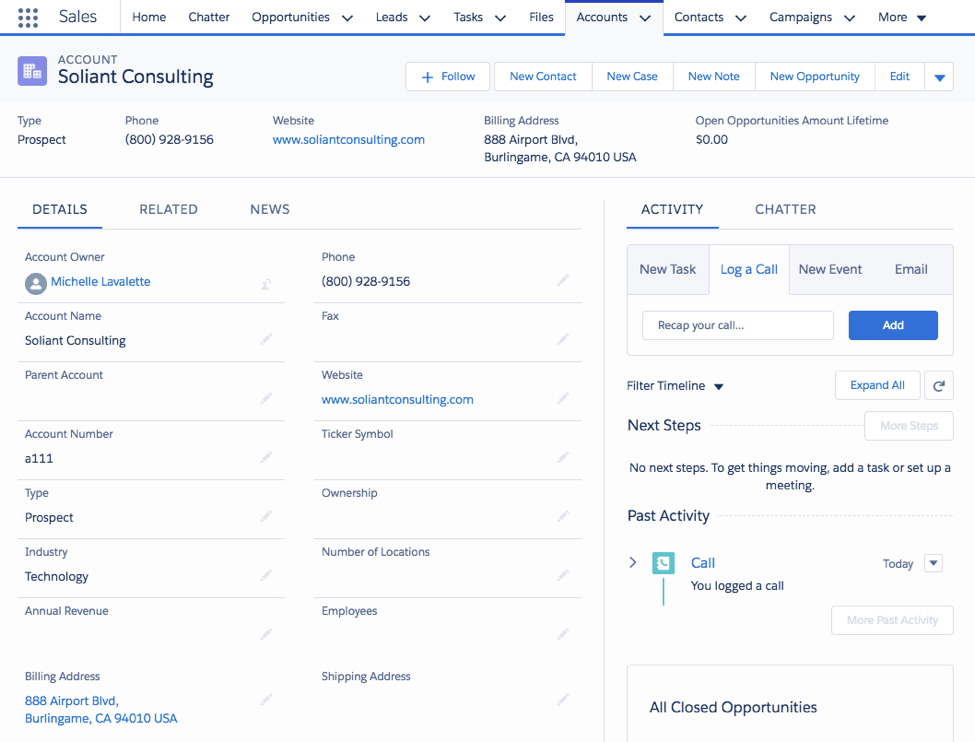
Take a look for yourself. Here’s the old Salesforce UI (see Figure 1 below):
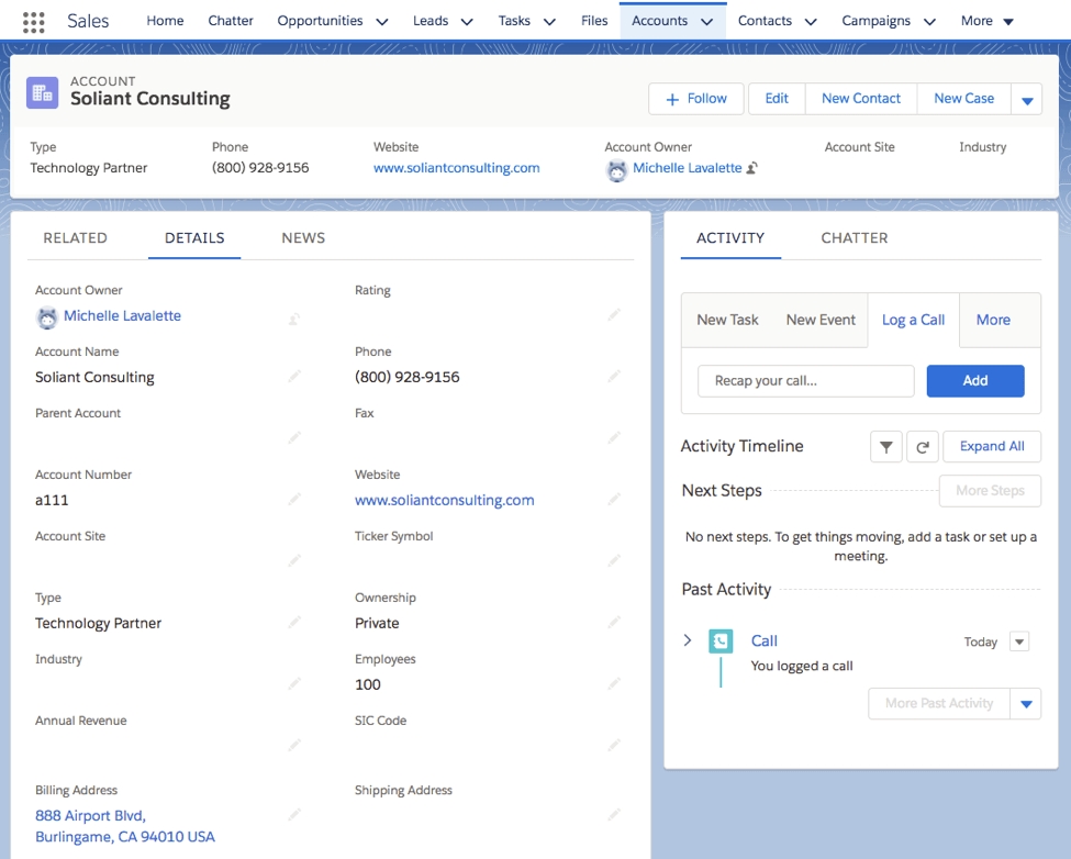
Now, here’s the new user interface coming with the Winter ’18 release as shown in Figure 2:
Why Your New Salesforce UI Matters
A user experience has a big impact on how a platform is used. If it’s horrendous, people don’t want to spend time in it. They don’t take advantage of its capabilities, and their investment gets a smaller return.
In fact, the biggest complaint I hear from my clients and other users is the contrast in the user interface. They can’t focus with all that white in the background. To be honest, I struggle to determine which field is which, but with the new design, I can distinguish field names from new values.
This new look and feel encourages users to focus on their work, rather than hunting down the details they need on a page. It might seem like a small change to add some color break points and different fonts – but a clear layout increases usability and makes data entry less tedious.
Implementing the New Salesforce UI
Here’s the best part – you don’t have to do anything to enjoy the new user interface. Once Winter ’18 goes live, the new view will show for you and all other Salesforce users. If you don’t like the blue background and want to switch to the gray one I mentioned earlier, you can easily make the switch.
This UI change, along with other features such as customizable app pages, related list quick links, and custom lightning page templates, empower admins and developers to give their users exactly what they need to see when they need to see it. Dynamic components, for example, allow you to show users what they want to see when it meets a certain condition, taking custom Salesforce UI to a completely new level.
Users don’t need to worry about adjusting their usability practices. These updates just enhance what they already do and should alleviate some pain points for adoption of the platform.
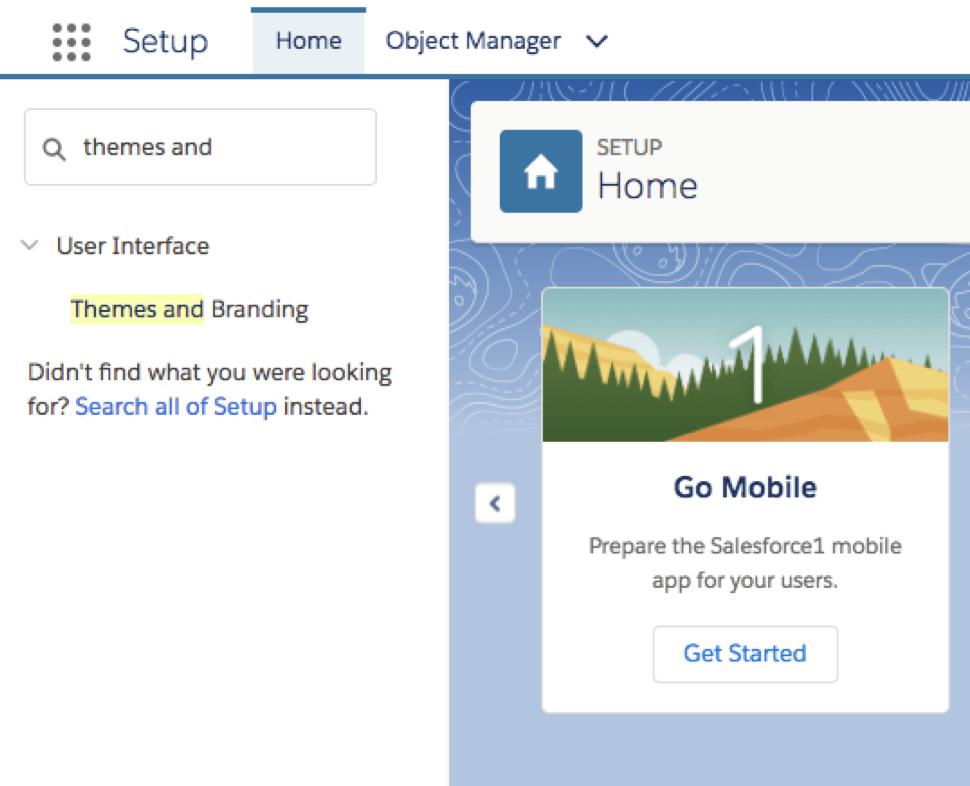
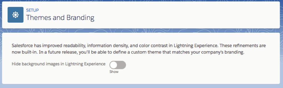
If you don’t love the new UI, you aren’t stuck with it. To turn it off, navigate to setup (see Figure 3), then type “Themes and Branding” in Quick Find, and choose “Hide” (see Figure 4).
What Will You Do with the New Salesforce UI?
Is your team excited about the new user interface? Do you have any plans to try out any of the other new features in your org? If you need help implementing any of them, please contact us or ask a question in a comment below.