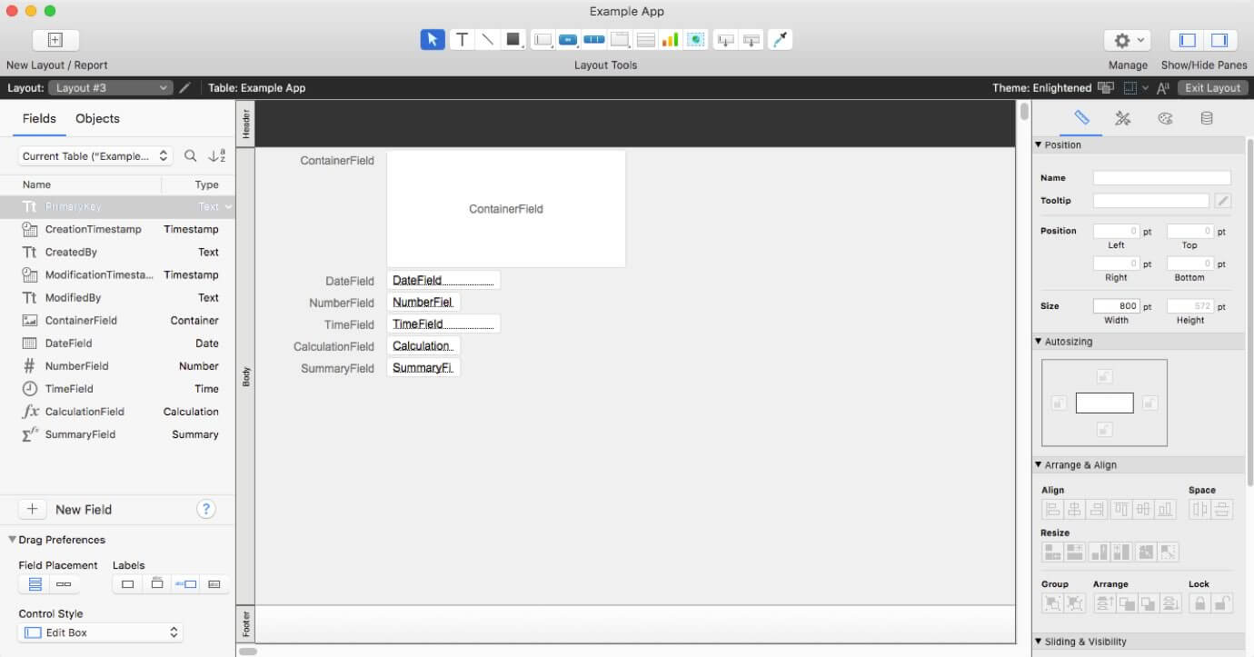
Over the past few years, FileMaker has started incorporating collapsible sidebar panes into the design of FileMaker Pro. They started with modernizing the Script Workspace, then added a right-hand pane in the Specify Calculation dialog box, and now the canvas in Layout Mode also follows the same design pattern (see Figure 1):
- A new left-hand pane contains two tabs labeled “Field” and “Object”. The Field tab contains the Field Picker, previously a floating palette, and the Object tab replaces the floating Layout Object window that was introduced in FileMaker 16.
- A new right-hand pane contains the Inspector. If you’ve ever lost track of where the inspector is, or whether it’s open, this should be a welcome change.
Familiar keyboard shortcuts apply to both panes:
- If you press command-K (control-K on Windows), the left-hand pane opens and closes. This was previously associated with opening and closing the Field Picker palette.
- If you press command-I (control-I on Windows), the right-hand pane opens and closes. This was previously associated with showing and hiding the Inspector palette.
Since the new panes are part of each window you have open in Layout Mode, they are controlled independently for each one.
I like how these changes bring more consistency to the FileMaker Pro user experience and anchor key information in predictable locations.
What else has changed?
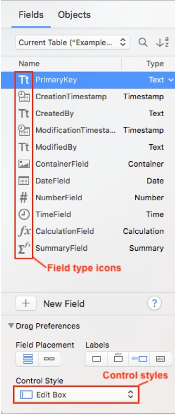
Generally, the contents of each of these panes are the same as in their FileMaker 16 equivalents, with a few notable differences (see Figure 2):
- The new “picker” includes icons that make it easier to recognize each field type on sight. (As in FileMaker Pro 16, you can change the field type from the picker rather than going to Manage Databases).
- You can now set field control styles directly from the Field tab, where previously you could only do this using the Inspector.
But there’s one other significant change: in the upper left corner of the screen, there is no longer a “book” to page through layouts or a slider to move through them quickly. I assume that this change was made in the spirit of simplifying the interface and to help prevent confusion between Layout Mode and Browse Mode. Until now, they used the same interface elements in similar ways.
As an advocate for new users, I’m very much in support of making the new user experience more intuitive, but I have to say that I’m going to miss these elements. For me, it’s second nature to navigate from one layout to another using the book or to jump to the first or last layout in the file using the slider. Fortunately, you can still use the same keyboard shortcuts for moving between layouts one at a time: ^↑ (control-up arrow) to move backward and ^↓ (control-down arrow) to move forward. If you have trouble with these on Mac, check your Mission Control settings in System Preferences.
How does it feel?
I’m still getting used to it. For example, here’s a window behavior that caught me off-guard: if your window is positioned in the middle of your screen with ample room to the right and left of the window, switching to layout mode will expand the window on both sides to accommodate the two docked panes. That’s all well and good. But if for instance your window is positioned all the way to the left of your screen, switching to layout mode will move the content area of your layout to the right. I find this a little disorienting, but it may be something I’ll adjust to over time.
Additionally, when working on some legacy systems with wide layouts, I feel a little cramped if I have both panes open at once. That said, a well-designed layout shouldn’t get excessively wide, where “excessively” is a subjective term but has to do with how much information the user can scan easily. Most layouts should fit just fine on a modern monitor – even in layout mode showing both panes – while leaving room to work in the “scratch” or non-display area as well.
However, if you ever find yourself limited in horizontal screen space or if you just want to position the inspector close to the objects you are working with, do not despair. You can still work with multiple Inspectors, each of which opens as a familiar floating palette. Simply open a second Inspector by choosing the menu item View > Inspectors > New Inspector, and then close the right-hand pane. Note that there isn’t a similar option for opening the Fields tab or Objects tab as a floating window.
I’m curious what working habits I’ll develop over time: when the right-panel Inspector will feel solid and reliable and how often I’ll finally need a floating one. I can tell that opening and closing the left-hand panel as needed will soon become second nature. What do you imagine your preferences will be?
If you have any questions about this or any other new features included in FileMaker 17, please contact our team. We’re happy to help your team determine the best way to leverage them within your FileMaker solution.
I really think FileMaker needs to rethink the whole dialog approach in the UI. It is still very annoying to have to open two or three dialogs, such as with the set variable script steps. Also, the script triggers on objects; I would love to see those accessible from the inspector. I think reworking the UI would really make FM design much faster (and reduce carpal tunnel!)
I think everyone has their personal favorites and frustrations with the FileMaker development interface. Because FileMaker Pro has a long tail in terms of versions to support, it can be tricky to make all the improvements that really are warranted, as this can cause issues with backwards compatibility. But I hear you: less clicking and more creative thinking. One thing I love is the growing availability of variables to many script steps. One thing I can’t stand is the initial “user-friendly” calculation dialog that doesn’t support typeahead or allow you to enter returns, where you must make an extra click to get to the useful one. After all this time, I still expect both of those things to be immediately available each time the initial dialog opens.