If you’re a project manager of any stripe, software projects or otherwise, you’re constantly in search of the perfect way to report on project progress. You’re specially addicted to charts — visual displays of project status — because they offer an effective means of communicating with non-technical stakeholders who just want to know whether the project will come in on time and on budget, and if not, how far off it will be.
You could write a book on this subject. But it all comes down to deciding what you are going to track as progress on a project, and then capturing progress information reliably and accurately. For the purpose of brevity I’ll draw a contrast between two popular approaches, earned-value reporting and burndown reporting, for the purposes of highlighting some shortcomings in each of them, drawing special attention to the burndown, which has garnered a lot of attention with the increased popularity of “agile” methods of software development.
Earned-value reporting
Earned-value management, or EVM, seeks to do two things:
- Define all the work that needs to be accomplished.
- Assign to each discrete piece of work a specific portion of the overall project
So, for example, in the work breakdown structure for a software project, there might be a task called “define database,” and the project team might assign that task a value of 1.5% of the overall project value. As tasks in the work breakdown get completed, credit for their value is “earned” and assigned to the project, and you get a nice chart that shows the overall earned value on the project marching steadily upward (or not) toward total project value (meaning, project complete). Consider the following image:
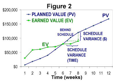
Here, the blue line shows “planned value,” meaning “the value we expect to have earned by a given point in time.” If this chart shows the entire project timeline, it appears this project has been assigned a total planned value of around $180,000, on a schedule of 12 weeks. To date, 8 weeks into the schedule (2/3 of the way), only about $100,000 of value has been earned (about 55%). At this point you’d hope to have about 67% complete, so the project is behind schedule. The schedule variance can be expressed in weeks or dollars, as the chart shows.
This method has a lot to recommend it. All the same, the “agile” camp have taken various shots at this method over the years, and they have some good point ( although they may be battling straw men to a large extent). The main criticisms revolve around two areas: how to break down the work, and how to decide when a piece of work is “done” and can claim its share of the earned value.
An agilist would look at my earlier example, and complain that the task “define database” delivers ZERO business value to the customer. Without some user interface or means to accomplish specific tasks, if the project stopped right there, the value delivered to the customer would be zero. An agilist (and others as well) would argue instead that we can only assign value to things like completed use cases or user stories, which are specifically written so as to describe the work in terms of visible customer value. A defined database, doesn’t help me, but a screen where I can enter call log information does.
It’s hard to argue with this criticism.
The second critcism revolves around the criterion of doneness. Following what Alistair Cockburn, in an excellent and widely-cited blog post, called the “not-even-a-sock” rule (my paraphrase), many will suggest that credit for being “done” with a piece of functionality can only be earned when the relevant code is completed, tested, and at least integrated if not deployed.
It’s wise to have strict and sensible criteria for doneness. This avoids the case of a project that is “almost” done …. except for QA and user testing, which were not part of the doneness criteria for individual work items. Oops. We all know how many weeks of work of that sort like to lurk at the end of “almost done” projects. But simply making the “done” criterion binary (all or nothing, 100% or 0) and making the rules for doneness strict doesn’t solve all the problems in this area, as we’ll see.
Burndown Reporting
The “agile” camp have for a while been championing a kind of chart called a burndown. This sounds less Felix Unger than earned-value management, which sounds like it might require horn-rim glasses and a mainframe. “Burndown” sounds folksy, direct, aw shucks we’re just developing software, not puttin’ on airs. But a burndown does just about exactly what an earned-value chart does:
- Breaks the work into definable chunks
- Assigns credit for the chunks as they get marked done
- Compares actual progress to a theoretical ideal of progress
Oh, and it turns the EV chart on its head, burning down toward “zero work left” rather than burning up toward “100% work complete.” It’s sometimes claimed that burning down to zero is more psychologically satisfying than burning up to 100, and who knows, this may be so. I do like the down-vs-up approach myself.
Here’s a sample burndown chart from Cockburn’s article:
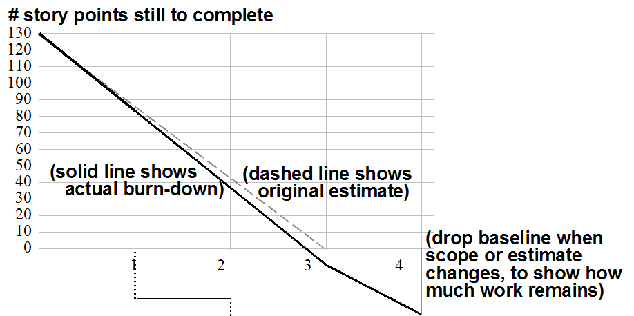
On the left, the chart is tracking story points, a unit of relative measure that we don’t need to delve too far into, but which is a way of assigning a fraction of overall project size to a piece of work (like a use case or user story). We see a black line burning down toward zero story points remaining, and a dashed grey line that shows the original ideal progress trendline. (In this case, scope has been added to the project along the way, which is indicated by the fact that the baseline has been lowered below zero). The bottom axis shows units of time, in this case “iterations” of let’s say two weeks apiece. So the project was originally intended to burn down 130 story points in a bit less than six weeks. It apears that about 40 points of scope have been added to the project, and the new target is at 8 weeks.
Various problems with the charts
It should be clear that these two chart types are more alike than different. Personally, I think some of the critiques of EV from the burndown camp are sensible. Work units should correlate strongly to delivered business value, and “done” criteria need to be set in order to prevent significant work from hiding in the project. And I like burning down rather than up.
All of that said, our organization has tried plain-vanilla burndown charts and found a few significant problems. Some of these are equally applicable to the EV charts. Here are some of the challenges we’ve encountered.
Projects just don’t burn down uniformly
The ideal trend line of the burndown chart implies strongly that a team ought to be able to deliver functionality at about the same rate from one end of a project to another. When you start talking about the need for “setup” or “rampup”, some agile folks will suggest that you need to find a way around this, you need to use mindsets like YAGNI, or build strategies like walking skeleton, and not get bogged down in rampup. Well, YAGNI and walking skeleton are great tools for the toolbox, but they don’t alter two fundamental facts (fundamental in my own observation);
- Teams become more productive as they get farther into a project. Toolsets and development environments stabilize, workflows gel, the requirements become clearer. Many projects, in my view, start out with a relatively flatter progress line, then accelerate toward the middle of the project
- Toward the end of a project, the rate of new feature delivery slows. However much we try to do QA as we go, and have QA be an integral part of marking a work item “done,” a couple of things get in the way:
- Some items can’t really be tested well till others are complete. These dependencies can be reduced or minimized, but to do so is not without cost.
- The customer MUST test work items to assure completeness, but most customers are NOT continuously or uniformly available over the course of a project. Additionally, many customers find it difficult to test on a feature-by-feature basis, as any divergence from their mental image of the completed software is disruptive. With the right customer and effective project management, this hurdle can be partially overcome.
As a result of all of this, project progress tends to follow more of an S-curve — flatter to start with, accelerating strongly through the middle, slowing again toward the end as the QA burden becomes relatively heavier.
“Done” is a blunt instrument
The not-even-a-sock view of work item doneness is a laudable one. By disallowing “partial credit,” the approach seeks to avoid the deadly “90% done” state. (As we all know, the completion date of a 90% item is in fact impossible to predict). But this approach, too, proceeds from the presumption that work can be completed and marked “done” in a uniform fashion across a project. In fact, on most projects, a work item has to go through several steps or stages to be declared done. A simple workflow might look like this:
- Coded and tested, available in test environment (developer has created the work and deployed to a test area)
- QA approved in test environment
In this simple case, developers build features, perform their own manual or unit testing, and deploy them to a test environment. A separate QA team member reviews each work item and either marks it done, or sends it back for more work.
This is the simplest workflow that allows for any amount of non-developer QA. But even here the issue of doneness is tricky. We can say it’s done when QA approves. But unless the dependencies between work items are very low, and the QA resource is continuously available, items are going to “clump” up behind step 2. Often a QA resource will not check an item the instant it’s marked “developer complete.” It makes more sense to review the items in batches, say once a week. But if done = “QA Approved,” this means items will only burn down once a week. Presto, the resolution of your chart is now at best one week, totally obliterating any idea of daily progress tracking. But daily progress tracking is a nice complement to the daily scrum (a practice we’ve found often very beneficial), as it gives the opportuity to identify and troubleshoot blockages almost as they occur. But with only weekly resolution on the chart, this opportunity is hindered if not lost.
OK, well we can go the other way and give the devs credit as soon as they test and deploy an item. That will give a smooth, accurate picture of how crisply the devs are moving through the work. but this has the opposite problem, that now a great deal of work can hide in the QA area. Effectively we just took QA out of our burndown. QA now effectively contributes zero to earned value.
Well, that’s clearly not right. We can try a third tactic, which one of our teams did recently: create one or more additional work items for QA. But how do you define those? Our team created additional user stories for QA, one per original user story. This allowed the stories to be burned down separately. But this created a lot of extra work items, and the team didn’t feel it was worth the effort. And this is all for a simple workflow. In an integration project, where items are being deployed into production instances, there might be several additional steps required to mark an item done. The more you compress those into a single definition of doneness, the more resolution you lose. If there are multiple steps, then seeing just one “done” line flattening out doesn’t tell us which step, if any, is causing the bottleneck.
So, erm, now what?
My thinking on all of this was crystallized by a paper written by Dave Anderson, that I found when looking around for “problems with burndown charts” in hopes of finding others who’d experienced similar issues. His paper, titled Managing Lean Software Development with CumulativeFlow Diagrams, can be found here. This paper gave specific shapes to the two main issues we were seeing: the non-uniformity of burndown on typical projects, and the struggle to track multiple kinds of doneness.
Anderson’s paper seeks the answer to both of these in something called a Cumulative Flow Diagram(CFD). Here’s an example from the article just cited (the bulk of my discussion is drawn almost directly, though not verbatim, from that article).
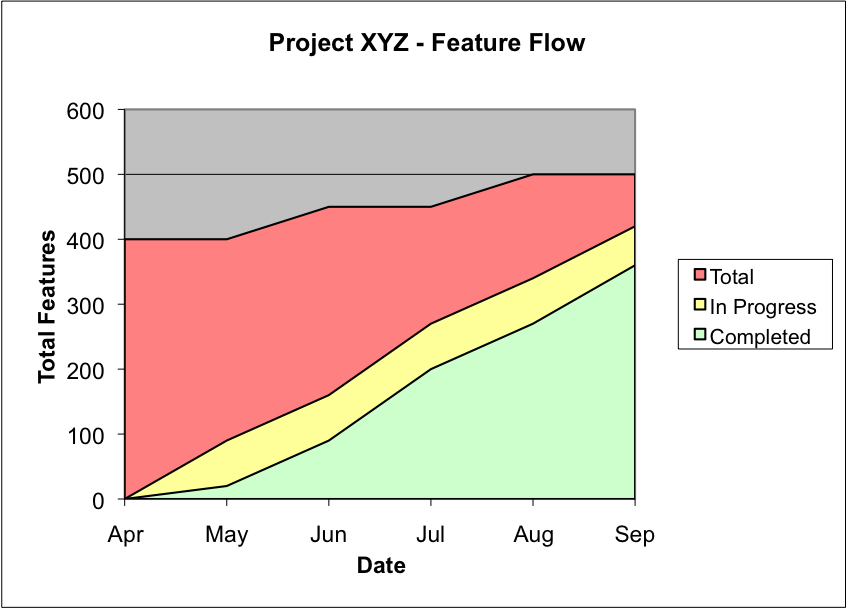
A few things to note about this chart. One, it is a burnUP chart. The vertical unit of measure is “features”, which might just as well be use cases or user stories. The second thing to note is that it has MULTIPLE burnup lines, corresponding to each of the states a feature can be in. This tactic meets all of our goals: for example, it allows developers to get credit for beginning a task, while also tracking the progress toward true completion.
Here’s a more complex example, for a project with more workflow states:
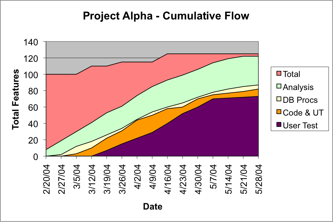
In this graph, we have a problem. The curve for Analysis is burning up smoothly. But, late in the graph, the amount of work in the analysis stage is increasing. This suggests the next stage, “DB Procs” (writing database stored procedures) is in fact the bottleneck. The work piling up in Analysis is just like partially built goods piling up on a factory floor. If you’ve read work by Eli Goldratt, such as The Goal, this should be a familiar image. The graph above shows us that work is getting stuck at the “DB Procs” machine. No surprise that the machines behind it in the flow (Code & UT, and User Test), are starting to sit idle, as shown by their flattening curves.
That’s plenty for one blog post. I have a lot more to learn about CFDs, and more thinking as to how to apply them to the work we do, but I wanted to share my impressions of various tracking methods so far, and some of the reflections on CFDs I’ve found. It seems well worth more investigation.
One thing I’ve observed is that agile trappings do not an agile project make. I have too often worked on an “agile” project where the deadline, scope and budget are fixed in a decidedly non-agile way, yet the project is run with agile terms and agile tools.
I think if a project can be well enough defined that the deadline, scope and budget can be pre-determined, trying to run it using story points is robbing oneself of tracking resolution. If the project is spec’d as a waterfall, burndowns are still useful, but they should track effort against budget.
This suggests one put units of hours up the left side, and track ALL tasks based on the estimate that was de-facto agreed on when the price was contracted. If the project has a fixed budget and a fixed set of tasks, and those tasks include things like requirements gathering, project management, setting up the database, and QA, why not burn those down too?
Hi there just wanted to give you a quick heads up and let you know a few of the pictures aren’t loading properly. I’m not sure why but I think its a linking issue. I’ve tried it in two different internet browsers and both show the same results.
Hi there! Thank you for letting us know. We've fixed the issue and you should now be able to see the pictures.