So much work in Salesforce has traditionally been completed by clicking back and forth through multiple screens:
“Oh, this is interesting. Let me look over here on this second page and then a third page to get more information and then jump page to my first dashboard to put all of the pieces together for that insight I need.”
It’s exhausting, right?
Fortunately, I’ve been doing this long enough to have uncovered some tips and tricks using Lightning Console Components to keep these page views to a minimum and see more information on one layout. I’m happy to share them with you. My insights apply to Sales Cloud and Service Cloud, but my example below applies to the Service Cloud.
How to Set Up Your Lightning Console for Side-by-side Views
Right now, to have your most significant information handy for a given case all at once, you most likely need multiple sub-tabs open for that case in your console. Unfortunately, clicking back and forth between sub-tabs takes way more time and energy than most would like. It’s messy and confusing.
To cut down on this, I found a quick way to see everything at once – side by side views in the console.
You can see what I mean in the screenshot below:
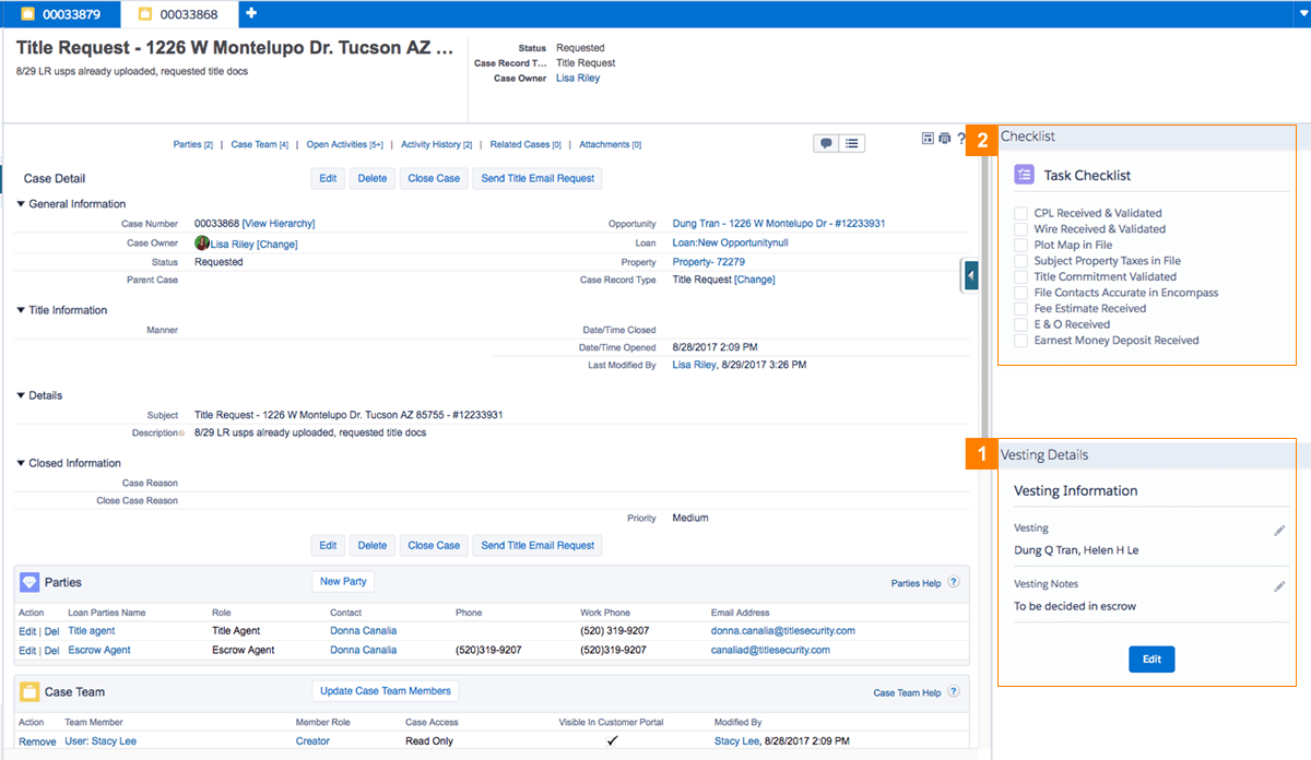
To get to each vesting detail, you need to move through a complicated hierarchical data model, as the details are several levels removed from the case in question. That means you need to navigate through several clicks (10 by my count) and several sub-tabs to get to the information you need.
- To minimize these click-throughs, I built a Vesting Information Box that appears directly on the right side of the layout.
- The same is the case with the Checklist box. Each checkbox represents a task related to the case. By presenting it side by side and making the interaction as simple as a check box, I could save the user lots of scrolling and four clicks per checkbox!
As you can see, this layout supported by custom Lightning components drives a major productivity boost! You can easily perform related interactions in context very quickly and get the information you need in far fewer clicks.
Even better, they’re not too difficult to set up.
How to Set Up Side by Side Layouts
All you have to do is create a custom Lightning console components and configure your console view to show them in the right-hand panel. The only thing to remember when building such a custom component is to make it expect the id of the record – in this example the case id – for which this component is expected to display contextual information. The component then uses the id to fetch and display such contextual information.
The component can display data that is directly related to the main record (checklist component) or data that is several levels removed from the main record (vesting Details component) and anything in between. Visualizing a UX that is easy and fits within the display space available are the only constraints so to speak!
Next Steps
My team and I are always looking for new ways to improve Salesforce for end users and help them become more productive and efficient. We’ve implemented this tactic for a handful of our clients, and it’s helped their processes go much faster.
If you need help building these Lightning Console Components, I’m happy to provide some direction. You can ask your questions in a comment below or contact our team directly.