Salesforce Lightning Multiselect
Salesforce Lightning looks great and works beautifully. To enhance it, I’ve added a new Multiselect component. Enjoy!
This is another Salesforce component blog… just a small one this time, showing you how to create and use my new Multiselect component.
For some of my other components, please look here:
- Lookup – Embed a Lightning Lookup in a Visualforce Page
- Datepicker – Lightning Datepicker
What I’m going to show is how to take the static HTML defined on the Salesforce Lightning Design System (SLDS) web page and turn that into an actual, working component.
Method
- Define the event that you’ll be using first. This event is used to tell the parent component that the selected value(s) have changed
- The event is called the “SelectChange” event.
<aura:event type="COMPONENT" description="Despatched when a select has changed value" >
  <aura:attribute name="values" type="String[]" description="Selected values" access="global" />
</aura:event>
Next, we add the markup for the actual component itself. It is composed of the button to trigger the dropdown and the dropdown itself. The button contains an icon triangle and some text indicating what has been selected. The dropdown list is an list driven by aura iteration. All selection/deselection logic is driven by the controller and helper classes.
<aura:component >

  <!-public attributes-->
  <aura:attribute name="options" type="SelectItem[]" />
  <aura:attribute name="selectedItems" type="String[]" />
  <aura:attribute name="width" type="String" default="240px;" />
  <aura:attribute name="dropdownLength" type="Integer" default="5" />
  <aura:attribute name="dropdownOver" type="Boolean" default="false" />

    <!-private attributes-->
  <aura:attribute name="options_" type="SelectItem[]" />
  <aura:attribute name="infoText" type="String" default="Select an option..." />

    <!-let the framework know that we can dispatch this event-->
  <aura:registerEvent name="selectChange" type="c:SelectChange" />

  <aura:method name="reInit" action="{!c.init}"
      description="Allows the lookup to be reinitalized">
  </aura:method>

  <div aura:id="main-div"  class=" slds-picklist slds-dropdown-trigger slds-dropdown-trigger--click ">

      <!-the disclosure triangle button-->
    <button class="slds-button slds-button--neutral slds-picklist__label" style="{!'width:' + v.width }"
      aria-haspopup="true" onclick="{!c.handleClick}" onmouseleave="{!c.handleMouseOutButton}">
      <span class="slds-truncate" title="{!v.infoText}">{!v.infoText}</span>
      <lightning:icon iconName="utility:down" size="small" class="slds-icon" />
    </button>

    <!-the multiselect list-->
    <div class="slds-dropdown slds-dropdown--left" onmouseenter="{!c.handleMouseEnter}" onmouseleave="{!c.handleMouseLeave}">
      <ul class="{!'slds-dropdown__list slds-dropdown--length-' + v.dropdownLength}" role="menu">

        <aura:iteration items="{!v.options_}" var="option">
          <li class="{!'slds-dropdown__item ' + (option.selected ? 'slds-is-selected' : '')}"
            role="presentation" onclick="{!c.handleSelection}" data-value="{!option.value}" data-selected="{!option.selected}">
            <a href="javascript:void(0);" role="menuitemcheckbox" aria-checked="true" tabindex="0" >
              <span class="slds-truncate">
            <lightning:icon iconName="utility:check" size="x-small" class="slds-icon slds-icon--selected slds-icon--x-small slds-icon-text-default slds-m-right--x-small" />{!option.value}
          </span>
            </a>
          </li>
        </aura:iteration>

      </ul>
    </div>
  </div>
</aura:component>
As you can see, this is mostly just basic HTML and CSS using the Salesforce Lightning Design System. To make it work, we implement a Javascript controller and handler.
These Javascript objects load and sort “items” into the select list:
init: function(component, event, helper) {

   //note, we get options and set options_
   //options_ is the private version and we use this from now on.
   //this is to allow us to sort the options array before rendering
   var options = component.get("v.options");
   options.sort(function compare(a,b) {
                  if (a.value == 'All'){
                    return -1;
                  }
                  else if (a.value < b.value){
                    return -1;
                  }
                  if (a.value > b.value){
                    return 1;
                  }
                  return 0;
                });

   component.set("v.options_",options);
   var values = helper.getSelectedValues(component);
   helper.setInfoText(component,values);
 },
As you can see, I’m not touching any HTML – I’m relying on Lightning’s binding framework to do the Actual rendering – by adding to the options list, Lightning will apply that to the “ object defined in the component and render the list (hidden initially).
Also note that there is an ‘All’ value that the system expects. Change this to whatever you like, or even remove it, but remember to change the text here in the controller :).
Another interesting area to explain is how selecting/deselecting is done:
handleSelection: function(component, event, helper) {
  var item = event.currentTarget;
  if (item && item.dataset) {
    var value = item.dataset.value;
    var selected = item.dataset.selected;

    var options = component.get("v.options_");

    //shift key ADDS to the list (unless clicking on a previously selected item)
    //also, shift key does not close the dropdown (uses mouse out to do that)
    if (event.shiftKey) {
      options.forEach(function(element) {
        if (element.value == value) {
          element.selected = selected == "true" ? false : true;
        }
      });
    } else {
      options.forEach(function(element) {
        if (element.value == value) {
          element.selected = selected == "true" ? false : true;
        } else {
          element.selected = false;
        }
      });
      var mainDiv = component.find('main-div');
      $A.util.removeClass(mainDiv, 'slds-is-open');
    }
    component.set("v.options_", options);
    var values = helper.getSelectedValues(component);
    var labels = helper.getSelectedLabels(component);

    helper.setInfoText(component,values);
    helper.despatchSelectChangeEvent(component,labels);

  }
},
I am using a custom object: ‘SelectItem’ because I’m not able to create a ‘selected’ attribute on Salesforce’s built in version. In the code above, I’m looking at this value and either adding the item to the list, replacing the list with this one item or removing it. In this case I’m using the shift key, but this can be customized to any key. Finally, I update the text with the new value and if multiple value, the count of values.
One tricky area was handling hiding and showing of the select list – I use the technique below:
handleClick: function(component, event, helper) {
    var mainDiv = component.find('main-div');
    $A.util.addClass(mainDiv, 'slds-is-open');
  },

  handleMouseLeave: function(component, event, helper) {
    component.set("v.dropdownOver",false);
    var mainDiv = component.find('main-div');
    $A.util.removeClass(mainDiv, 'slds-is-open');
  },

  handleMouseEnter: function(component, event, helper) {
    component.set("v.dropdownOver",true);
  },

  handleMouseOutButton: function(component, event, helper) {
    window.setTimeout(
      $A.getCallback(function() {
        if (component.isValid()) {
          //if dropdown over, user has hovered over the dropdown, so don't close.
          if (component.get("v.dropdownOver")) {
            return;
          }
          var mainDiv = component.find('main-div');
          $A.util.removeClass(mainDiv, 'slds-is-open');
        }
      }), 200
    );
  }
}- When the button is clicked, the list is shown.
- When the mouse leaves the button, but does not enter the dropdown – it closes
- When the mouse leaves the button, and enters the dropdown, the close is cancelled.
- When the mouse leaves the list, it hides.
Seems simple, but getting it working nicely can be tough.
To use, simply add as part of a form (or without if you’d like):
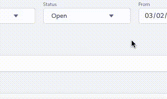
Here’s what it looks like:
That’s all for now.
Get the Multiselect Component Files
Enjoy!
Moving Forward in Lightning
Have questions? Let us know in a comment below, or contact our team directly. You can also check out our other posts on customizing your Salesforce solution.
This is great.. I do think there is a typo. On the last part where you put it on a page I believe it should say <c:MultiSelect aura:id="my-multi-select" options="{!v.Options}"
Looks like you keyed in myoptions by accident
Good catch. I’ll fix this up asap.
Hi I just tried to use your solution ” https://github.com/rapsacnz/MultiSelect” but it is giving error
I think it’s either incomplete or some file is missing.
Controller is not mentioned in cmp.
It’s not a copy and run.
I will test it out later today. The controller does not need to be specifically referenced in the component as it gets composited together by the Lightning compiler. The error you gave me is extremely generic and very hard to debug, unfortunately. I’ll let you know what I find.
I tried to use it without making any further changes but it doesn’t run. When i chnage the attribute type of
&
to String[] it loads the screen but than doesn’t show anything in dropdown even if i am passign few values as parameter in
Is it possible for you to debug it further ad let me know why it is not running as it is.
I was able to get it running quite easily.
If you are unfamiliar with Chrome’s dev console, I suggest you read up on it.
I’ve updated my readme with some helpful extended notes.
See here: https://github.com/rapsacnz/MultiSelect/blob/master/README.md
If you still can’t get it running, you probably need to ask a colleague for help, as you are basically having implementation issues that are no linked to any real issues with the component.
Good luck.
To add to previous comment i am trying to run it using application and calling same cmp in application
Multi Select!!
Post update of Extended Implementation Example it’s working perfectly fine.
I’m sorry I’m not sure what you mean here. However, I’ve decided to stop fixing issues such as these. If you have a problem, please fix it and issue a pull request.
A small typo in the js controller in setInfoText function : the last “else if” condition refers to “values” which does not exist –> replace with “labels”. Thx for the component though!
Thanks for the heads up – I’ll fix that right away. Glad you liked the component!
How do I use this component it in VF page?
Use lighting out. There’s a lot of info out there on how to do this.
Hi, i m new in Salesforce and i’d like to use your stuff on my lightning component.
The thing is that when i try to implement your Multi select component nothing dropdown .
Maybe i miss something, because i am not realy good in english but should i enter my own value to test? And how can i make it work with my own multi-select fields ?
Unfortunately, there are many things that could go wrong implementing the component… If something is not working, try using the Chrome debugging tools and you should be able to determine the cause of the problem.
Could you please shared the code for lightning Lookup field with multiple selection
Sorry, I haven’t built that component. You are going to have to do this one on your own. You should be able to use my component as a jumping off point though.
HI Caspar, could u please help me out with this error
Invalid type: SelectItem[]: Source
I cant understand why is this not saving… As i cant see anyone else getting this error.
Thanks in advance.
Hi Jake,
Get a fresh copy of the source here: https://github.com/rapsacnz/MultiSelect
I’ve changed from using SelectItem objects to using regular Javascript Objects.
Also, I’ve fixed a couple of other small issues and refreshed the styles and markup.
Caspar
Thank you for the awesome component article.
Hi Caspar,
How did you resolve the scrolling issue on the mobile browser where you have more values to select from than to display?
Hi Dharmesh, this component is not designed to handle this. Try using a ui:scrollerwrapper around the drop-down – I can’t guarantee this will work though. Let me know if you find a fix.
Fantastic component! I am using works very well, it is not clear if and how I can pass prefilled values?
Hi Casper,
I have downloaded code and markup from https://github.com/rapsacnz/MultiSelect/ and using in my developer org. and it’s really amazing. I am getting issue in multiple selections of items. I am running this component from with your suggested demo application code and didn’t change anything but not able to select multiple options.
Could you please help me out there, if I am missing something.
Regards,
Chetan
Have you tried debugging the component using your browser? right click “Inspect when running the component and you can examine and debug that javascript as it runs.
Hi,
Seems that in MultiSelectController.js 42 line ($A.util.removeClass(mainDiv, ‘slds-is-open’);) is responsible for closing picklist on click.
Not sure why is it added and is it needed.
But multi select still didn’t work.
Had to remove lines 37-39 from MultiSelectController.js
I think if you remove those lines, it’ll never be able to deselect an item. You may want to remove line 42 if you just want it to close on a click outside. You could replace lines 27-42 (the whole if-else block) with lines 28-32. Let me know how that works.
I wrote it to add to the list if the shift key was pressed. Otherwise, it just selects a single item.
Hi Caspar,
Multiselect is not working. Can you please share the code?
Can you please upload the code for both the component and app as well? This will help me and others as well to get a clear view.
Thanks!
Vai
At the bottom of the blog post is a link to all the files you need. Here it is again for convenience: https://github.com/rapsacnz/MultiSelect
Great post and utility!! I am getting an error when I preview – any thoughts what could be the issue?
This page has an error. You might just need to refresh it.
Action failed: c:MultiSelect$controller$init [undefined is not an object (evaluating ‘options.sort’)]
Failing descriptor: {c:MultiSelect$controller$init}
I think your problem is that options is null – did you feed the multiselect with a list of option objects? If you are still having trouble, try using my new picker (that uses pills to show multiple options selected) – here: https://github.com/rapsacnz/lwcMultiSelect
Hi Casper,
I’ve created a field on which when clicked will open a popup with few checkbox options. When an item is selected, the corresponding checkbox is checked and the selected value is displayed in the field. When I click on the field again and the popup opens, I want the selected item to still be checked unless I select a different item or refresh the page containing the field that displays the selected item. I’m able to display the selected item value in the field but when I open the popup again, it doesn’t show the selected item’s checkbox as checked. Can you please let me know how to do that?
You’ll need to init the multiselect with selected values.
So on selection, you’ll need to store the selected values – perhaps on the parent component via a bound attribute or you could use session storage – ie: `sessionStorage.getItem(key);
sessionStorage.setItem(key, value);` On init, you’d either check your options list for selected items or use the session storage to init the list. Hope this helps!
Hi Caspar, thanks for the implementation, hoping to implement this for my use case. Could you please provide example usage for LWC? I tried following the approach you mentioned for Aura, but it does not seem to work for me, and I can’t figure out what’s wrong.
I’ve actually converted this component to lwc. Here it is: https://github.com/rapsacnz/MultiSelect.
Use like this: <c:MultiSelect label=”Furniture” options=”{!v.options}” onchange=”{!c.handleSelectionChange}”></c:MultiSelect>
Also, you can’t incorporate an Aura component inside an LWC – you can go the other way, but if your host component is LWC, you need to use an LWC.
Hi Caspar,
I have tried multi select picklist i.e. LWC solution and looks like it is not working as expected. I have tried the following code and none of the given options are displayed in dropdown. Also, one default selected option (i.e. Value 1) is also not shown in the component:
HTML:
JS:
options = [{ label: ‘Value 1’, value: ‘Value 1’, selected:true },
{ label: ‘Value 2’, value: ‘Value 2’, selected:false },
{ label: ‘Value 3’, value: ‘Value 3’, selected:false }];
Please help me out so i can use your component.
Looks like you are using “smart quotes” – which don’t work.
Remove all the “‘” bits and replace them with “””. eg
{ label: ‘Value 1’, value: ‘Value 1’, selected:true } becomes:
{ label: “Value 1”, value: “Value 1”, selected:true }