Summary
The introduction of FileMaker 13 gave us a tremendous amount of new user interface functionality. One example of this is the venerable Hamburger Menu (a.k.a: Sidebar, a.k.a: Drawer.)

Regardless of how you feel about this widget, this example is meant to demonstrate a technique that you can use how you wish in your own solutions. The ultimate implementation is up to you.
What It Is
You may have seen the three little horizontally stacked lines in the upper corner of your favorite website or app. That is what is known as a Hamburger Menu, since it resembles a patty in between a bun. Or, if you grew up like me, between two slices of Wonder Bread, which never worked as well as a bun…but I digress. The typical implementation of a Hamburger Menu is that by clicking or tapping on the widget, another area slides into view to reveal more information.
There may be some debate about whether or not to use a Hamburger Menu in the first place. Most debate pertains to its use in mobile platforms. I would argue that there is still a place for it, depending on your needs.
The fact is that users have been exposed to this widget in one place or another. It still appears in popular apps and frameworks such as jQuery Mobile. If you are viewing this page in Firefox or Chrome on a desktop computer, it is likely visible right now. For most people, it will be familiar and somewhat intuitive.
I would also make a case for its use in FileMaker by saying that it is very common to build complex menus in larger custom developed solutions. FileMaker solutions can be focused on a particular job which may require more detailed controls. Main navigation can still be concise and exposed, while lesser used, more granular controls can be relegated to the Hamburger Menu. Having a this technique in your tool kit doesn’t hurt. I will leave whether to use it or not up to you. Now let’s get on with it.
Three Little Lines
The premise is simple: click the widget and get a drawer to slide out. The drawer contains more buttons to click on. It might seem obvious to use a slider, and that is the main object we are using. We will just want to have some control over animating this control to make it intuitive. In this example, we will use it as a navigation menu.
There are two panels involved; one is blank and the other panel will contain our menu. The blank panel is there to give the appearance of the other panel opening and closing. If you lay out the panels side by side, it might look like the diagram below.
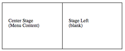
To reveal our Menu Content, we must start at Stage Left, and move to Center Stage. To close the menu, we then move back to Stage Left. In other words, Exit…stage left! (Which reminds me… I need to practice my Rush – YYZ drum solo…from their album “Exit…Stage Left”. On second thought, forget it, that’s impossible.)
A potential blocker with only using a slider is that the slider object in FileMaker allows clicking through to whatever is beneath it in the layout, which can be un-desirable. It can also cause issues with managing layouts and objects and get stuck on the wrong panel. We also want our menu to hide if we click anywhere else in the layout. How do we handle these?
C-C-Combo!
We use a combination of a popover object and a slider object. By placing the entire slider object into a popover, we get the best of both worlds. When you click out of a popover, it closes automatically. Even better, we can capture the close event with a script trigger and animate the closing of the menu.
Another advantage in using popovers is that you do not “click through” popovers, so it helps in keeping the layout tidy and navigable. Using a popover allows us to use this technique in list view as well.
Hopefully this demonstrates an easy-to-use technique that you can leverage in your own solutions. It doesn’t have to be exactly as presented here, but this should provide a starting point and possibly give you ideas of how to build on what we have shown. Let your imagination run wild.
Sample File
Get the sample file from GitHub:
Note: Click the “Download Zip” link at the bottom of the right hand column on the GitHub page.
References
- Using popovers in FileMaker Pro http://help.filemaker.com/app/answers/detail/a_id/12011
- Using slide controls and slide panels in FileMaker Pro http://help.filemaker.com/app/answers/detail/a_id/12012
- A Brief History of the Hamburger Icon http://blog.placeit.net/history-of-the-hamburger-icon/
Thank you for sharing! Regards out of Sunny Miami, Florida.
Nice demo, Mike! I love it! One minor improvement, though: you made the popover a few pixels larger than the slide control, to allow the shadow to display correctly. This means the user can click outside the slide control, but inside the popover, and fail to dismiss the popover. You can improve this by giving the slide control a line thick enough to contain the entire shadow, but set its color to 100% transparent. The shadow will attach itself to the fill and display through the transparent line. Then you can match the size of the slider to that of the popover, and the user only has to click outside the shadow to dismiss the ΓÇ£menuΓÇ¥ as expected.
Now to implement this thing. 🙂
Love this idea, Mike. And a guy called Gary Brusanowski used it to do some design magic with a CRM Prototype. Check it out here: http://www.filemakerprogurus.com/unique-filemaker-crm-prototype/
I did download the file but after I click at menu the file closes automatically. What can be wrong ??
I have not been able to replicate the issue. What version of FileMaker are you trying this with?
FM 16
By any chance do you have the advanced version of FM 16, to be able to open the script debugger? It looks like there may be a script trigger added to the layout you are going to, could that be the case? Have any modifications been made to that file?
Hi Mike, Thank you for your interest in my problem. I’m able to replicate issue all the time 🙂 so I left some video for you. Regards
https://drive.google.com/open?id=1GFSr2Tk5zZKkLe46l4Sw1zO2c5JhsfoP
Hi Mike, i didn’t found solution to solve this problem, right now I’m using FM 17 and it work fine. Regards
The link for the download is circular – it links to this page.