FileMaker 13’s charting functionality is a powerful toolset in which to create visual summaries of the data. It has come a long way in the past two versions, and by applying well-known techniques within FileMaker, one can create a better graphing experience. Today’s post will explore making charting a dynamic experience.
Update: Download for the Dynamic Charting demo has been added at the end of the post.
The Problem
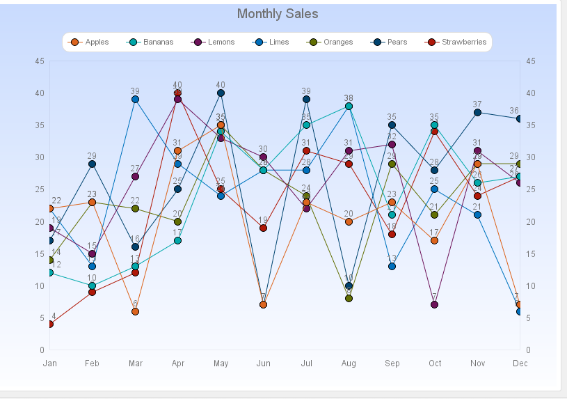
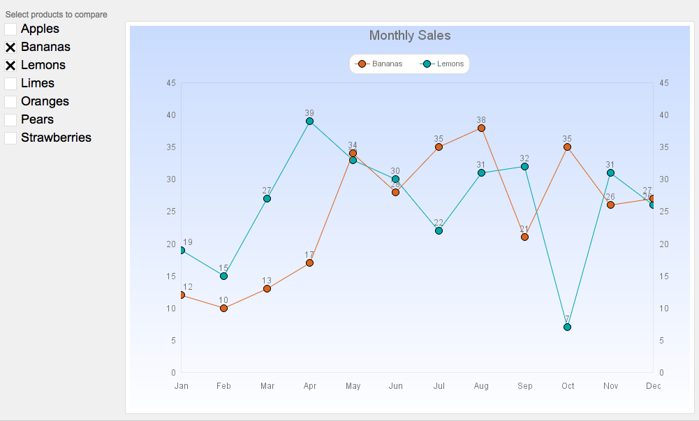
Charts are great visual tools, but they can quickly get messy and difficult to read. A chart that compares sales of different products throughout the year would get very unreadable if all the products were listed for all the months of the year.
The Solution
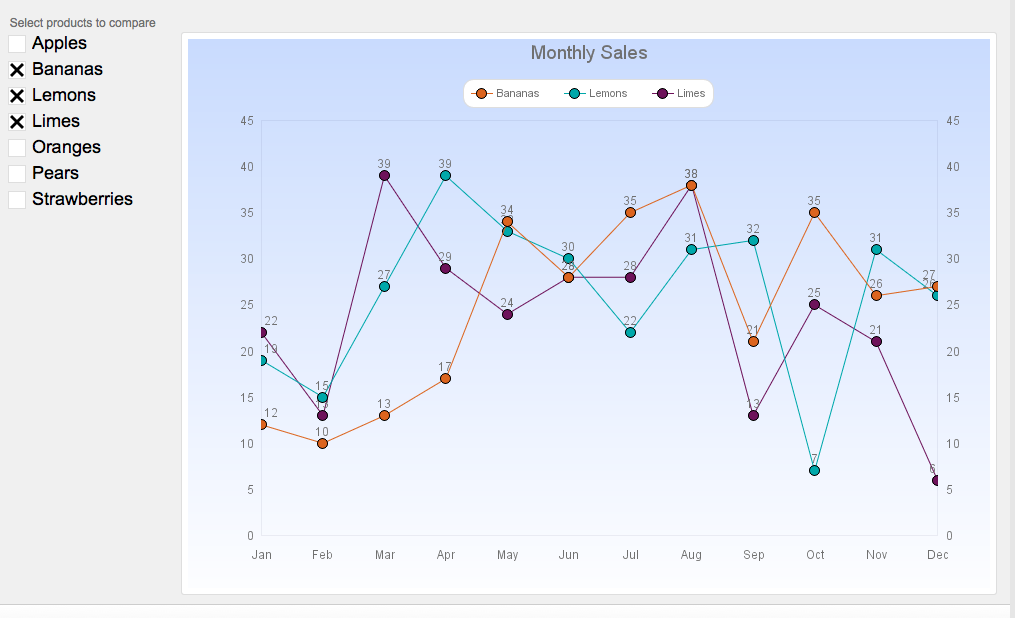
Instead, we can dynamically add or subtract data series from the graph to make a better comparison. For example, I could compare apple sales to orange sales, or apple sales to banana sales, or even lime sales to strawberry sales. Or I could compare four of the products to each other. Using ExecuteSQL and a global field, a graph can be dynamic and interactive.
The Set-Up
To start, I have a summary table which summarizes the total number of each kind of product sold in each month. I’ve also got a month name and a month number field. All of this is filled in using a script, and that script records something for all the products for every month, regardless of the total. If I sold zero limes in May, the total sales that is recorded is zero. This allows every product to have the exact same number of data points when it comes time to graph.
Using a summary table is a piece of optimization for this dynamic graphing example. The graph has up to 12 ExecuteSQL statements in it, and all of those could be running at same time. If each function has to do find the total number of sales on the fly, there could be a performance hit. Instead, the ExecuteSQL functions are returning lists rather than lists of on-the-fly sum calcuations.
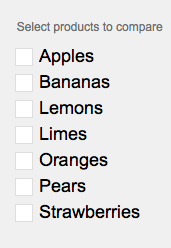
On the layout, I have a global field named g_Products next to the graph. This is a checkbox-formatted field with the list of products in the data to be graphed. The idea is that when a user clicks on a product, that product’s data will be displayed on the graph.
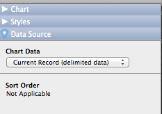
The chart that I will use in this case is a line graph, but any chart could be used in the same manner. It simply depends on the type of data upon which you need to report. Remember when you’re building a chart using ExecuteSQL, you would need to select the “Current Record (delimited data) option as the data source. This prepares the graph to receive the result from the ExecuteSQL statement.
X-Axis
The x-axis will be a simple ExecuteSQL Statement that shows the distinct months in the summary table, and puts them in order of month number:
ExecuteSQL("
SELECT DISTINCT "Month"
FROM Charting
ORDER BY MonthNumber";"";"")
I am choosing to pull the month names from the summary table so that only the months that have data will be generated. If it is March, I may not want to see the month “Apr” on the graph with no data.
Y-Axis
Defining the data series is next. Each data series contains a label and the data. By definition, a data series is one kind of data. It can be the number of bananas, or the heights of players, or the average grades. A data series is simply a list of the data that I want to show.
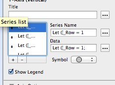
Since I have seven products, I’m going to need seven data series. Let’s build those. First, the label.
The data-series label comes from a simple GetValue() statement:
Let ([_Row = 1 ];
GetValue (Charting::g_Products ; _Row )
)
Notice that I am not using a lot of whitespace in this calculation to make it look good. Instead, I have the variable declaration on the first row of the Let statement. This allows me to edit the _Row value without having to open up the calculation dialog box for the label.
For the Data in the series, I first define the row, and then declare another variable with the name of the product in that row of the global field. Finally I use that product name in the ExecuteSQL statement:
Let ([_Row = 1;
_Item = GetValue (Charting::g_Products ; _Row )];
If ( NOT IsEmpty (_Item);
ExecuteSQL("
SELECT TotalSales
FROM Charting
WHERE Product = ?
ORDER BY MonthNumber";"";"";_Item ))
)
In this statement, I’m asking for the TotalSales data for any records that have the Product name that matches the value in the _Item variable. Notice the IF statement surrounding the ExecuteSQL statement; I do not want this function to run if the _Item variable is empty.
Note, some may realize I could have used $Row in the Series Name and it would be still viable for the Data. That is certainly a point; but it jumps into the realm of Variable Scope. For more information see Wim Decorte’s post here.
The Series Name and Data statements are then copied to all the other data series that I will need, while changing the value of the _Row variable in each copy. That is it. The ExecuteSQL statement in each data series will find the data from the summary table that matches the product in the correct row of the global field. The fifth data series will show the list of total sales for the fifth item checked in the global field. If there is no fifth item in the list, the nothing will return in the ExecuteSQL statement, and nothing will be drawn on the graph.
See the Post-Script below for a quick discussion of the data-series colors used.
A Further Exploration
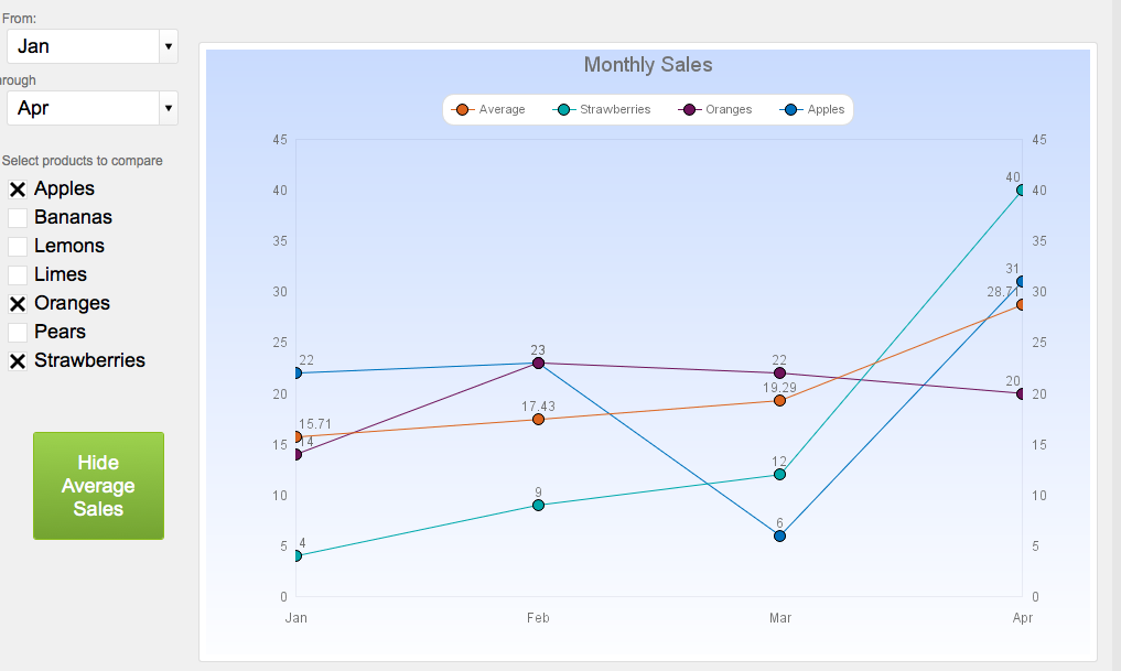
Once we’ve gotten used to this, global fields open up many other new ways to dynamically show the data. Here is an example using a start and end month range:
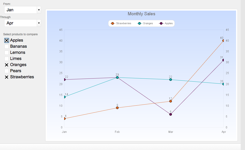
This was accomplished by asking the ExecuteSQL statement to limit its search for months that fall with in the range. The data table contains month names as well as month numbers. This ExecuteSQL statement is limiting its pull to records that fall within the range, in this case month 1 to month 4. In this case the x-axis label is using the same ExecuteSQL statement to grab the month names.
Finally, one can program buttons to draw or erase data on the graph. In this example, the button on the left will let the user hide or show the average sales for each month in the given range. This is accomplished simply through setting a global field to a 1 or 0. The ExecuteSQL statement will only run if the global field is set to 1.
Here is the statement:
If (Charting::g_ShowAverage = 1;
ExecuteSQL("
SELECT AverageSale
FROM AverageSales
WHERE MonthNumber >=?
AND MonthNumber <= ?";"";"";Charting::g_MonthStart; Charting::g_MonthEnd );"")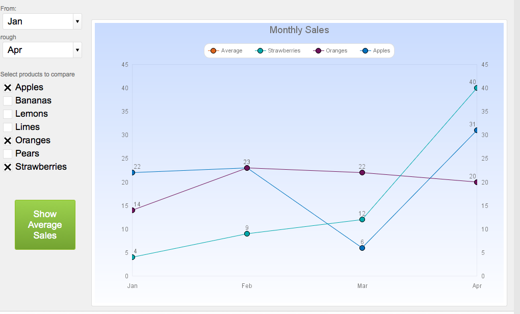
In Summary
Combining global fields, ExecuteSQL and the charting functionality gives developers a powerful tool to create context-free dynamic charts that can be used to read all kinds of data. Rather than building a separate chart for each possible comparison, one can use one chart to deliver all the data needed in a strongly interactive scenario.
Post-Script
A field that is formatted in a checkbox will have its contents generated in the order in which the boxes are checked. If I check “Apples”, “Oranges”, and “Limes”, the contents of the field will be a return-delimited list in that order. If I unclick “Oranges” and then click it again, the order will change: Apples, Limes, Oranges (in a return-delimited list).
THUS, the first item in a list will always have the first color of the chart’s color-scheme. In the first list, Apples has the orange line. If I unclick Apples, then the color shifts for each series and “Oranges” gets the orange line.
There are ways to prevent this. This can be explored in another post. But the color shift is something to consider. If it is not confusing to the users, don’t worry about it.
Get the Dynamic Charting Demo
If you have any questions, please reach out to our Carafe team.
Thanks for the explanation, Jeremy, of how to tie ExecuteSQL and charting together, with the addition of global fields.
I have what (maybe) is a more simplistic question about parsing information from the output of an ExecuteSQL, for use in a chart.
I’m using COUNT to count the number of occurrences from a field, via the basic COUNT query in a FM calculation. Let’s call the calculation field “Output1”:
ExecuteSQL (“SELECT field9, COUNT (*) TotalCount FROM Table1 GROUP BY field9 HAVING COUNT(*) > 1 ORDER BY COUNT(*) ASC” ; “” ; “”)
Straightforward and it returns (as an example) to Output1:
,2
Desktop,59
Laptop,94
Smartphone,136
In this case the first return (” ,2″) means no response. There’s also a wide variation from 2 to 136.
In the FM charting tool, when I choose the Bar chart and link to the current record’s Output1 for my Y axis, I would expect the charting tool to let me parse the details within the Output1 field via comma-delimited setting, so that the Y axis has null, Desktop, Laptop, Smartphone and the data for the bar chart itself has 2, 59, 94, 136.
What it does, instead, is merely return each of the four (” ,2″ and “Desktop,59”, etc) as the Y axis with the data in the bar chart all showing 0.
I can’t seem to find a way in FM charting to have it comma delimit (or tab delimit, for that matter) the content within a field.
Could certainly create additional fields, parsing out the content of the calculation field into two separate fields (one text, one number) but that presents a bigger headache of needing two Y axes (and certainly isn’t as elegant a solution).
Am I just pushing the charting into a territory it’s not supposed to be used in FM? Would be a pity since it’s great for mocking up reports from MySQL data, and charts are an added visual bonus.
TSig,
Thanks for your comment. I believe you could do what you're asking: parse out the data into the two columns within the charting mechanism, but you'd have to add variables to hold the part of the data you want. Maybe in the X-axis, you could filter for just the first value in each row, and in the Y-Axis, filter for the 2nd value for each row in the list. I haven't tried it yet, but I think it could be accomplished.
Thanks very much for this explanation.
Is there a demo file linked to this? I couldn’t find one but would love to look under the covers if you can share the file described in your write up.
Thanks again for the explanation.
I also would LOVE to see a demo file of this technique!! Would be very handy! And thanks for a great article!
Hi Jeremy,
Thank you for creating this content it is great. Can you please provide a demo file?
Thanks,
Rich
What you describe in this article is exactly what I’m trying to accomplish using individual student test scores for specified subjects during a particular date range. I would also appreciate the demo file or suggestions. Thank you for the article!
Hi Jeremy.
You must get this comment often. Please provide the demo file if there is one available.
Thank you for all your help.
Hi Carl. I do get the request sometimes. I’ll post the demo file and a video regarding the technique very shortly.
Thanks for reading. I’m glad it was useful to you!
Hello Jeremy,
Thanks for a very helpful technique! Got this to work for a set of scores, charting the average score over a specific time period.
At the end of the post you mentioned the issue of the colors being assigned in order, instead of based on their value; is there a solution? Haven’t been able to find anything specific on the subject thus far. Would be great to know if there was.
Thanks a lot in any case!
In reply to myself; I’ve fixed it!
In the end I figured that for my case of 5 different labels, I’d need to make a pilcrow separated list with 5 positions with either empty or filled values. This was not too hard to setup, using PutValue() found at: https://www.briandunning.com/cf/1569.
If anyone wants a more detailed description or example, feel free to contact me. It does work like a charm.
Hey.
Thanks for the information on that. That’s a great technique to use.
Did you ever end up uploading a demo file for this somewhere??
Hi Angie.
Apologies for the delay. The demo file will be posted shortly here today.
Let me know if you need further assistance.
That’s really cool, thank you!!
This is great Jeremy. Took me a while to figure out a couple of things but it was down to my data structure. Very cool.
One general question – do you know if its possible to use a variable in the Select statement? e.g.
SELECT $_Measure (where measure is defined as either a variable or obtained via a LET?
I’m thinking if this is possible it means one chart can show multiple measures (e.g monthly sales, or production etc)
Nick.
I’m glad you find it useful. And yes, you can do what you’ve described. We talked about it on the FileMaker community. Feel free to drop a line as you continue to explore it and I can help out.
Thanks
Hi Jeremy
Thanks again and for your help on FileMaker community.
I’ve got it working nicely now, dynamic in 3 dimensions:
1. Products (apples, oranges etc.)
2. Measures (sales, production, receipts etc.)
3. Dates (from / to)
Awesome stuff!
Thanks again
Sure thing, Nick. I’m glad you were able to extend the charting. Hit me up anytime for further refinement and extension.
Hi,
Thanks for this helpful subject (that I’m translating to show temperatures of a specific month among several years)
Olny one question : how do yo do to have one color by curve it’s not obvious with FM…;-)
Thanks a lot for your assistance.
Gérard from Paris with snow
Howdy.
I’m glad you find this useful.
Each line is determined by the chart color theme. There’s no way to change individual colors. You do know the order of the colors, however, so you can adjust your data set to match the order.
Thanks. That was extremely helpful!
Hi Jeremy,
Thanks for this post. Really interesting. I’m wondering if this is possible to create without having custom functions. I am on FMP15 (not advanced). In particular, I am unable to create these custom functions.
_Field1 = _FIELDREF_getField ( MonthSummary::Month ; True );
_Table = _FIELDREF_getTO ( MonthSummary::Month ; True );
_ORDER = _FIELDREF_getField ( MonthSummary::MonthNumber ; True );
Thanks!
A
Hi Andy,
Sure, but it would be serious handicap. Developing in FM is so much easier and efficient when you use FileMaker Advanced. Those custom functions are meant to make sure you use an actual field reference and not a hard-coded field name. Part of defensive coding so that if the field or TO ever changes name, the code does not break. You can use the GetFieldName() function directly and parse out the relevant parts to get to either the TO or the field name.
Here’s the definition of the “_FieldRef_getField” function:
Let(
[
_fieldRef = If(
PatternCount( fieldRef ; “::” ) = 0 ; GetFieldName( fieldRef ) ;
fieldRef
) ;
_split = Substitute ( _fieldref ; “::”; “┬╢”) ;
_field = GetValue( _split ; 2 )
];
If(
Quoted = True ; Quote( _field ) ;
_field
)
)
Unfamiliar with this technique so I may be missing something but where exactly are the custom functions being used? I see them under Manage custom functions but not sure how they are used and no mention of them in the article.
OK, I see it now, it is used to get the X-axis Titles. Is that the only place custom functions are used?
Thanks. Great solution.
The average does not look good. There must be something wrong.
I am on FM18
Hi, Trevix
In 2019 we launched https://carafe.fm, a free open-source tool for implementing JavaScript in FileMaker. You may wish to take a look at the chart bundles available there and leave a comment if you have questions on a specific bundle:
https://carafe.fm/tag/chart/