Part Two: Numbers are hard to understand
Some numbers are easy for us to understand. I understand one. Ten is easy to get. I can also get my mind around one hundred and maybe even into the thousands. Beyond that, it is very hard for me to completely get my head around a million, and especially a billion, trillion and so on.
Now, I know what the numbers mean, and I know how to perform functions to work with large numbers, but to really get an understanding of what a number represents easily becomes lost to us when the numbers get large. Our brains are simply not wired for working with numbers, or even logical thinking for that matter. For an enlightening article that explains this in more detail, I suggest Fear of Numbers by Neil deGrasse Tyson, and also check out the second lecture from the Life in the Universe course available at iTunes U.
For example, how long does it take to count to one hundred, if we count at a rate of one per second? That’s easy, let’s just convert it to sexigesimal time units (like that is easy to understand) and we get one minute and forty (1:40) seconds. How about a thousand seconds? That will take just over 15 minutes.
To get to one million, you will be counting for over a week and a half. A billion will take you 32 years of counting non-stop, and to count at one per second to a trillion will take you, I’m so sorry, 32 thousand years.
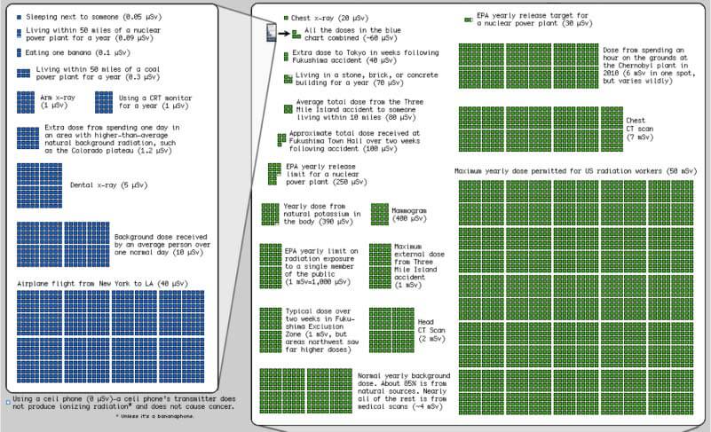
This is all to underscore the importance of clearly representing numbers, especially large numbers, visually and in a meaningful way. The webcomic xkcd has a very good example of communicating information that is typically difficult for people to visualize, in a chart they published shortly after the Fukushima disaster to educate people on radiation doses.
Adding visualization to your data gives it meaning that may be otherwise lost on your intended audience. Understanding how to represent numbers will allow your data to communicate much more than the data alone.