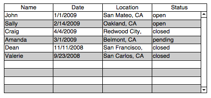
Design is important, even in the often pragmatism-driven world of business applications. And when it comes to design, there’s one element in particular that drives me nuts: screens that are crammed to the gills. Now, don’t get me wrong: I’m also driven nuts by having to click more than I have to. If it takes me five clicks to get somewhere that might otherwise have been reached in two, I’ll complain just as vociferously. But I think database developers – as opposed to public-facing website designers – exhibit an almost visceral fear of white space. Somewhat akin to people being uncomfortable with silence in conversations, I’ve seen even the most experienced developers fill their entire screens with data and interface elements. Lines, squares, columns, buttons… One simple example: take a data grid. This one’s ugly, right?
Now when approaching a fix to this grid, many developers will simply color the lines differently, and perhaps fiddle with the fonts, and maybe address that pesky left margin on their four data columns. This isn’t that far off from what I’ve seen of some systems. But what if you place high value on reducing visual noise? In my opinion, it’s the job of a designer to help bring forward what’s important and to de-emphasize (but still leave accessible) what isn’t. I take it as axiomatic that the more you can remove from an interface, while preserving functionality, the better. With this philosophy in mind, here’s another look:
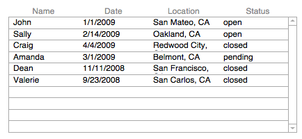
Hopefully it’s a given that this second version is at least somewhat more attractive, but beyond making it pretty, notice the strategy of peeling away elements. Obviously I’ve removed some of the lines. Your eye can infer the vertical columns in a grid this small: you don’t actually need the verticals. It’s useful to leave the horizontal lines to communicate that these elements are rows as opposed to simply a single formatted block of text. The alternating row shading, a throwback to the accounting-green tractor fed printers of 1000 years ago, is also unnecessary: in a grid this small, it’s just clutter. Your eye can easily differentiate between rows. Notice too that I punched back the gray of the grid lines and the font color of the headers. Again, the goal here is to inform, but reduce noise and draw the user’s eye to what’s important. The darkest text is the actual data in the grid, with gray used to guide without fighting for attention. Just these three steps – remove extraneous lines, remove the alternating shading, and drop back colors used for labels and lines – has, I’d argue, made a big difference. I’d recommend finding ways to make the screens in your databases less noisy, less cluttered. Your users will thank you for it, perhaps even without really recognizing why.
With the vertical lines in place, the positioning of the column headers makes at least intellectual sense — they are centered between each pair of lines. If you take the vertical lines away, the headers cry out to have a more sensible relationship to the data in their columns. At that point, it seems to me, you want to left-justify each header so it lines up with its column data on the left.
EXCEPT for the date which I always vastly prefer to see right-justified 🙂
Agreed. Naturally there’s more to do. The third column needs more width, the font is a bit too big, or the rows are a bit too narrow, and so on. My one point was about visual noise; however, to finish the design some more steps are required… perhaps fodder for future posts!
I don’t understand your argument against alternative shading. I don’t find that part being absent from the second example an enhancer in any way. I agree that the contrast could be different with a colored row but that’s all. Otherwise, agreed.